ITP Website Redesign
Redesigning the official website for Interactive Telecommunications Program at NYU, Tisch School of Arts.
Design Prompt: Interactive Telecommunications Program is a department at Tisch School of Arts, New York University in the heart of New York University. The department deals with Art at the intersection of Technology and is also called the Center of Recently Possible. The goal of the redesign was to create a modern, responsive, and user-friendly website that accurately represents the ITP department's values, programs, and community.
Team: I served as the Project Lead and Designer for the redesign. For more information about the entire team, please refer to this link.
Time Frame: 6 months
Design Process:
1. Research:
The redesign of the ITP department website was informed by a range of research and data-gathering methods, including user surveys, feedback sessions, website analytics, and competitive analysis. The competitive analysis phase aimed to identify the best practices and design patterns of other similar programs like Parsons Design and Technology, Pratt Institute, and the MIT Media Lab. This research helped to inform the design decisions and best practices that the ITP team implemented in the new website.
Website analytics were also used to inform the redesign process. The team analyzed user traffic patterns and page visit metrics to better understand the information architecture of the old website and identify the most popular pages for prospective students. This information helped to guide the design of the new website, ensuring that important information was easily accessible and prominently displayed.
2. UX Audit:
The redesign of the ITP department website began with an audit of the existing website to identify areas for improvement. The audit revealed that the old website suffered from a range of problems, including a cluttered and text-heavy design, inconsistent branding, and outdated visuals. The website was also difficult to navigate, with important information buried in submenus or hard to find pages. Additionally, the website did not effectively communicate the department's offerings, with many programs and resources not being clearly explained or highlighted. The audit also revealed that the old website did not prioritize the needs of prospective students, with important information scattered throughout the website rather than being easily accessible from a single location. Based on these findings, the ITP team developed a set of design principles and goals to guide the redesign process and ensure that the new website would effectively communicate the department's values, programs, and resources to prospective students.
3. Site Map and Information Architecture
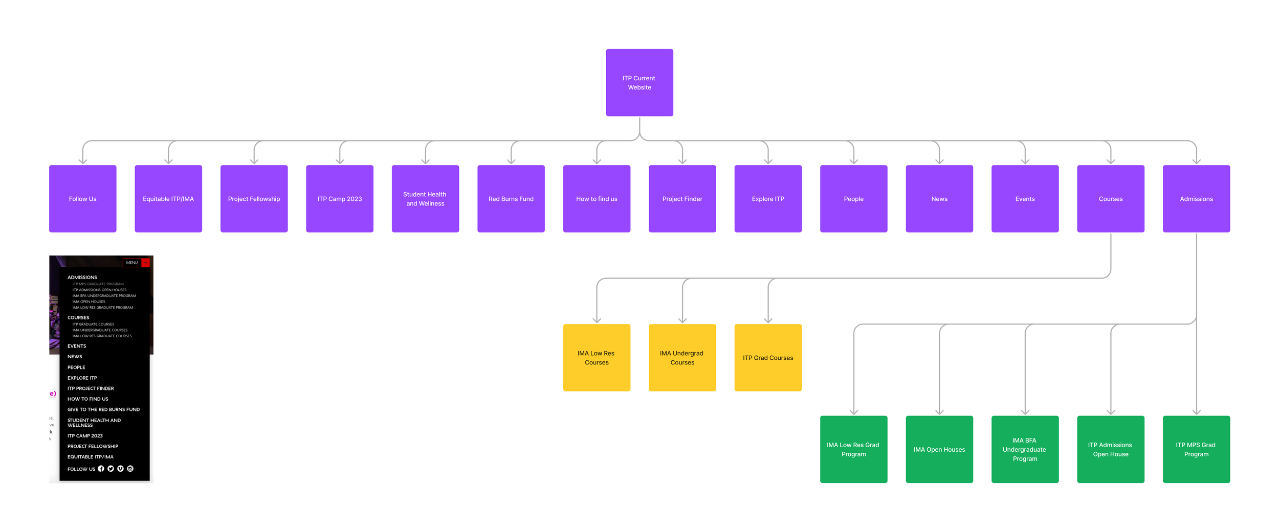
After auditing the old website, the ITP team studied the site map and developed a new information architecture. Here are the key highlights from improvements in new IA-
Prioritized the needs of prospective students by making key information and resources easily accessible from the homepage.
Streamlined the website's structure and categories, making information easier to find and reducing clutter.
Developed a new taxonomy for the website, providing a consistent framework for organizing content across different pages and sections.
Created a clear hierarchy of information, making it easier for users to understand the relationships between different pieces of content.
Improved user flow with clear calls-to-action and navigation elements, guiding users through the website and helping them find the information they were looking for.
Reduced the number of submenus and hard-to-find pages, making the website easier to navigate.
Old Site Map
Proposed Site Map
3. Site Map and Information Architecture
After auditing the old website, the ITP team studied the site map and developed a new information architecture. The new structure prioritized the needs of prospective students and streamlined the website's categories, making information easier to find. The team also developed a new taxonomy for the website and created clear calls-to-action and navigation elements to improve user flow. By developing a new information architecture, the team laid the foundation for a successful redesign that better served the needs of prospective students.
5. Wireframes
The next step in the process was to move each of the pages to Figma to explore possible design alternatives and come up with a high fidelity wireframe in terms of how the content hierarchy would be displayed.
5.1 Initial Wireframes
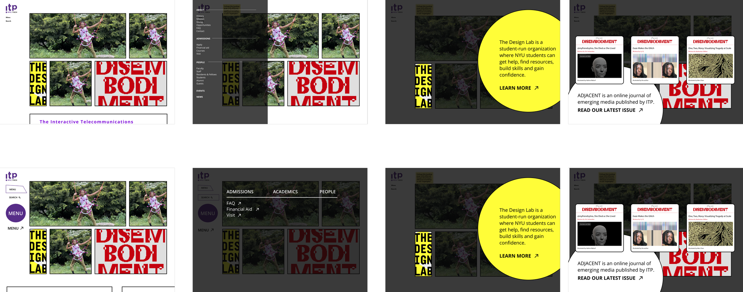
As part of the redesign process, the ITP team created initial wireframes to explore different grids, layouts, and menu options for the landing pages. Simone Salvo and Elizabeth Perez played key roles as lead designers on the project, guiding the development of the wireframes and working closely with the rest of the team to ensure that they accurately reflected the project goals and the needs of the target audience. Ultimately, the initial wireframes helped set the stage for a successful redesign, providing a solid foundation for the creation of the final website design.
5.2 Version 1
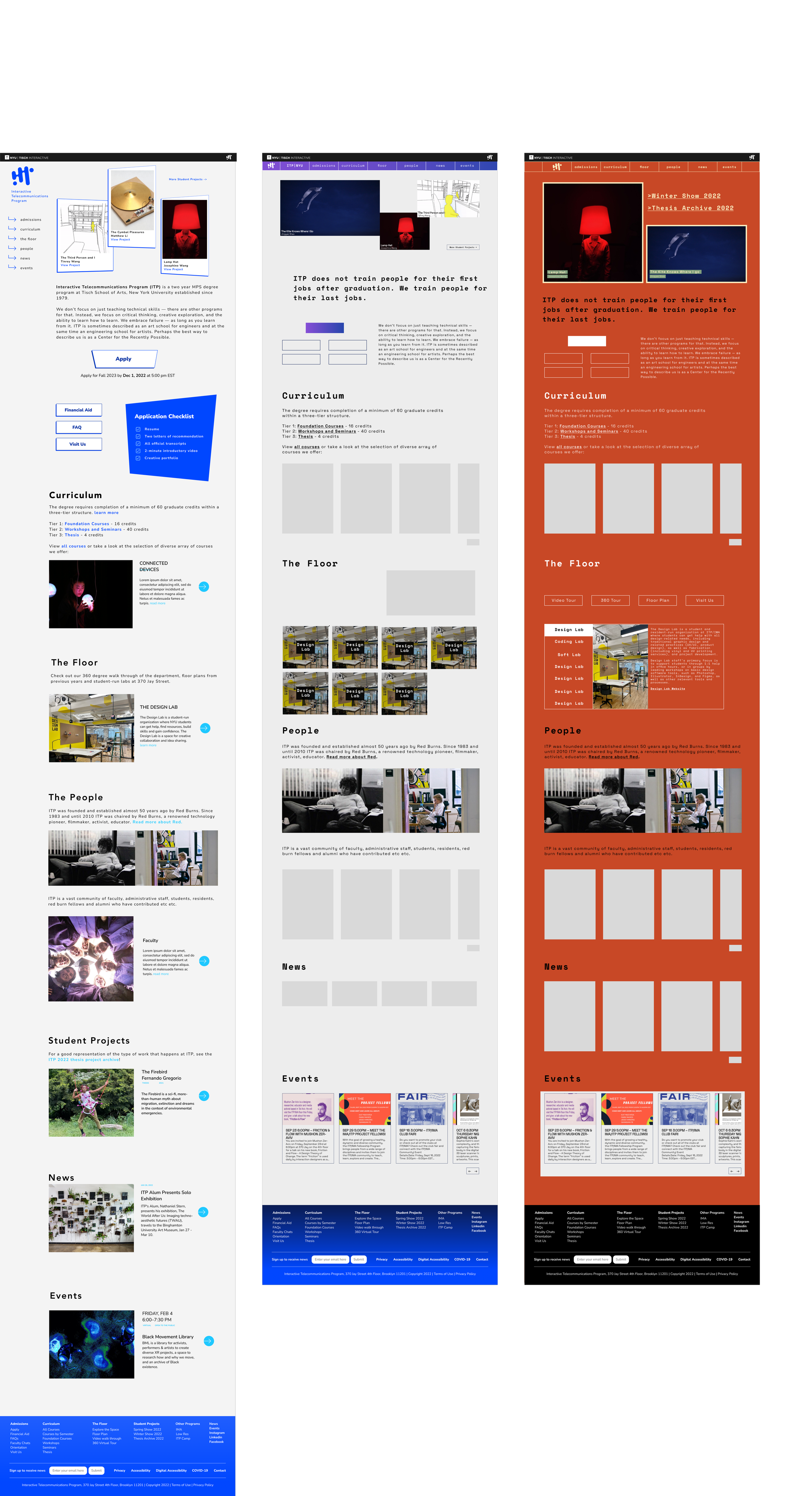
The first version of the website was developed with the idea of "serious play" in mind, aiming to create a design that was playful yet refined.
While the initial design was visually striking and engaging, it also presented a number of accessibility issues in terms of color contrast, font legibility, and button asset placement. These issues could have prevented certain users from fully engaging with the website, limiting its reach and effectiveness.
As a result, the design team went back to the drawing board, using the feedback from early user testing and accessibility audits to refine and improve the design. The end result was a new version of the website that maintained the playful spirit of the original design while also being more accessible, usable, and inclusive for all users.
5.3 Version 2
The next version of the website aimed to address the issues of color accessibility and button placement that were present in the initial design. The design team also explored different menu options to make the website more intuitive and user-friendly. In addition, the new version incorporated the official ITP logo, providing a stronger sense of branding and identity for the department. By addressing these key issues and incorporating the new logo, the design team was able to create a more polished, refined, and effective website that better served the needs of its users.
5.3 Version 3
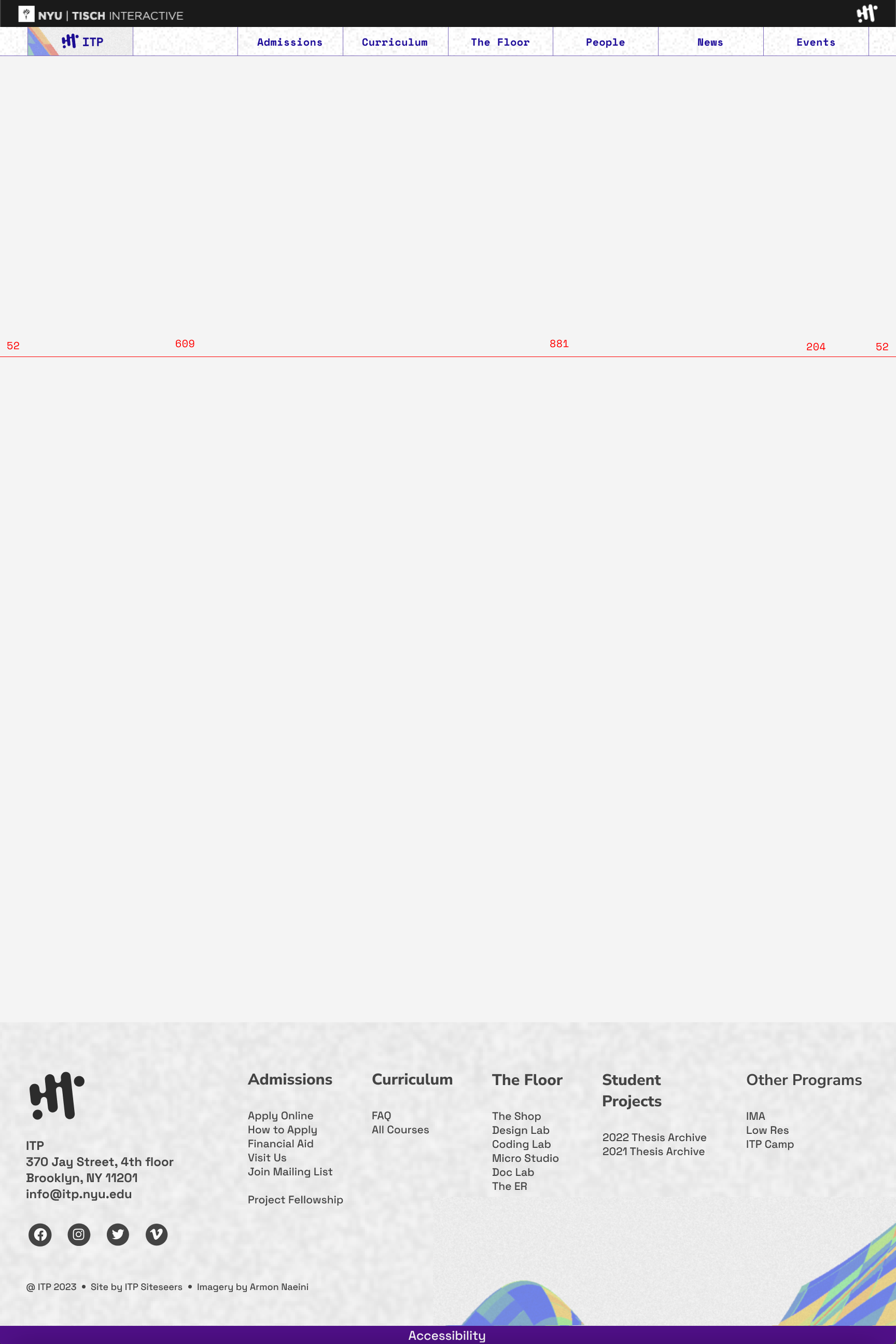
The next version of the website incorporated color accessibility and included a range of footer options to make the website more functional and user-friendly. In addition, the design team collaborated with second-year ITP student Armon Naeini to incorporate his artworks into the website, adding a unique and creative touch. These changes helped to create a more engaging and visually appealing website, while also improving its accessibility and functionality for users. At this stage the team also started working on internal pages.
5.4 Final Version
Please Note: This project is currently a work in progress and currently undergoing Usability Testing. You can check out the Live Site here and also Team Members Details here. Project Details including research, wireframes, lo-fidelity prototype, high fidelity prototype etc. to be added soon here.


