
Line of Loss
Visualizing conflict between India and Pakistan
This project was an exploration of the intertwined history of India and Pakistan through the lens of cricket rivalry, conflicts, and wars. By analyzing historical data and utilizing various visualization techniques, we tried to highlight the impact of human cost of continuous conflicts.

Research
Our research began with compiling a database that includes:
Major conflicts and wars between India and Pakistan.
Political leadership (Prime Ministers and Presidents) during key events.
Cricket matches, their locations, and frequency over the years.
Before we started formalizing our research we also found out that the year we were woking on this project also marked the 50th anniversary of the 1971 war between India and Pakistan on 16th December.
After going through the articles and previous research we created our own database of conflicts; ruling leaders (PM, President); cricket matches, and their locations. Here is the document embedded on the right.

Data Visualization
Plotting data on flourish
Once we created the database using official sources (cited at the bottom) we decided to plot it using flourish and see if can find any patterns. Using Flourish, we analyzed trends and patterns in the data, revealing that cricket matches were more frequent in peaceful times, whereas during conflicts, matches were mostly held at neutral venues or not at all.

p5.js Visualization
Due to limited features of Flourish we created an interactive data visualization using p5.js, representing:
Green dots for matches held in Pakistan
Blue dots for matches held in India
Yellow dots for matches on neutral grounds
White dots for wars and conflicts
This visualization provided a timeline from 1947 to 2021, demonstrating the correlation between conflicts and the frequency/location of cricket matches.

Scrolly Story
We also attempted to create “Scrolly-Story” website making elements
Glitch for interactive storytelling
Adobe Illustrator & Figma for designing visuals
Mapbox Studio to visualize match locations geographically to show how we've always been at “war” - it's in the form of cricket when it's not on the battlefield.


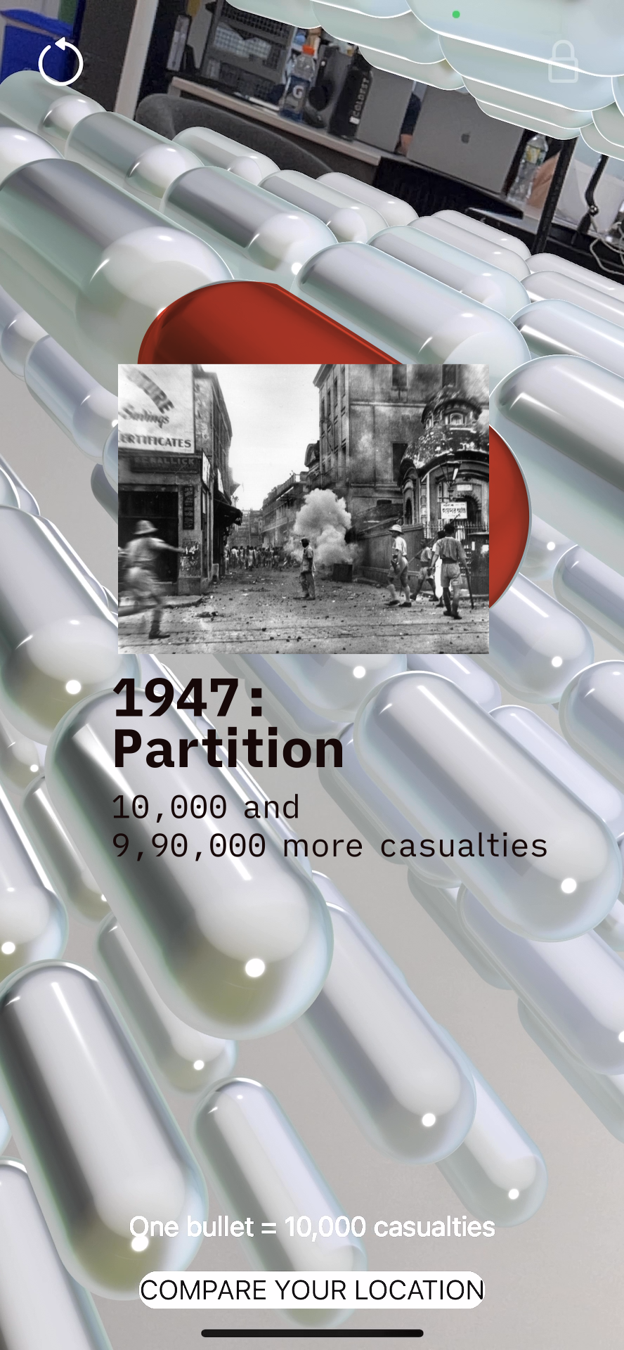
AR Experience - Visualizing War Casualties
Upon deeper analysis, we realized that the Indo-Pak conflict has persisted for 75 years, resulting in over 1,070,495 casualties. This insight led us to pivot towards an AR experience illustrating the human loss.
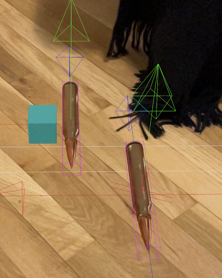
Our initial idea was to use bullets, each representing 10,000 lives lost. However, rendering thousands of 3D bullet models caused performance issues
Alternative Approach: Scale vs. Chaos
Instead of overwhelming the user with chaotic visuals, we opted for a scale-based comparison, showing:
How many lives were lost compared to familiar population sizes.
A feature that compares the number of casualties to the user's location, offering a personalized perspective. For example:
"The total number of people who lost their lives equals 66% of Manhattan’s population."
Conclusion
This project underscores the deep-seated impact of war on sports, national identity, and human life. It goes beyond statistics, providing an immersive, data-driven experience that urges users to reflect on history’s consequences.
By bridging sports, politics, and human impact, we hope to spark conversations around conflict, peace, and shared histories.